Uniqlo Redesign
UX/UI APP DESIGN
UX/UI APP DESIGN
ROLE
Research, Survey, Personas, Ideation, Design, WIreframing
DURATION
2 Months
TOOLS
Photoshop, Illustrator, Sketch
THE CHALLENGE
THE CHALLENGE
To take a brand that I like and push myself as a designer to do a complete redesign process on their mobile application. Uniqlo is a stable brand I go to, especially for their constant updates with incorporating technology and clothing together. I like their branding and brand philosophy; however, I only shopped at Uniqlo in person. I have never tried their online platform until recently, where I experience a few issues and found out other customers having similar experiences. These are examples of some of the reasons why I ultimately decided to use Uniqlo for my redesign.
Disclaimer: The views and opinions from this case study are strictly my own. I do not work for Uniqlo and I do not have access to their user data that would influence their current design which means this case is not exhaustive. I am also not suggesting in any way that Uniqlo should leave their current design and adapt to my redesign.
RESEARCH
PART ONE: COMPANY BACKGROUND
Uniqlo is a Japanese casual wear designer, manufacturer and retailer that is owned by Real Fasting Co., Ltd. Unqlio originated in Japan and started off selling casual wear men’s clothing. Their brand message is to” inspire the world to dress casually,” and their mission is to unlock the power of clothing. Uniqlo puts on an emphasis on simplicity, longevity and quality, which reflects the Japanese culture. Their motto is to dress casually, which means they focus less on trends and more on essential staple pieces. They are well known for mixing technology and clothing, HEATTECH and AIRism are examples of some. Their target demographics are young professionals who live in an urban and suburban population between the ages of 18 - 34 years old.
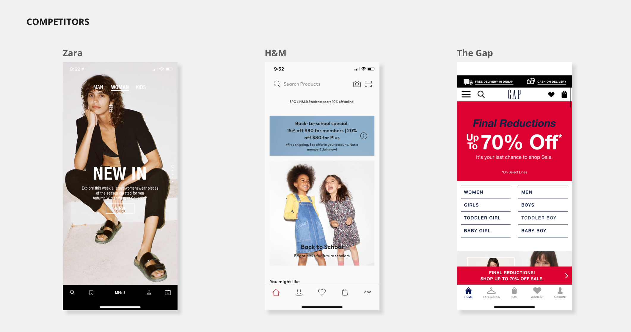
ZARA - has similar price points as Uniqlo expect the brand focuses more on styles and trends where the collection is continuously updating. They target people of all age ranges, especially people who are sensitive to fashion and more price-conscious.
H&M - has a diverse customer base with very affordable clothing due to mass production. They target fashionable and trendy consumers who see shopping as a social activity. H&M would constantly invite top designers to create a collaboration with, which helps increase their popularity.
THE GAP - share the same marketing strategies as Uniqlo, where they designed, manufactured and retailed their clothing. The Gap and Uniqlo also share similar branding as The Gap focuses on classic American styles. The target demographics are people who slightly older in their 20’s and 30’s.
PART TWO: USER BACKGROUND & FEEDBACK
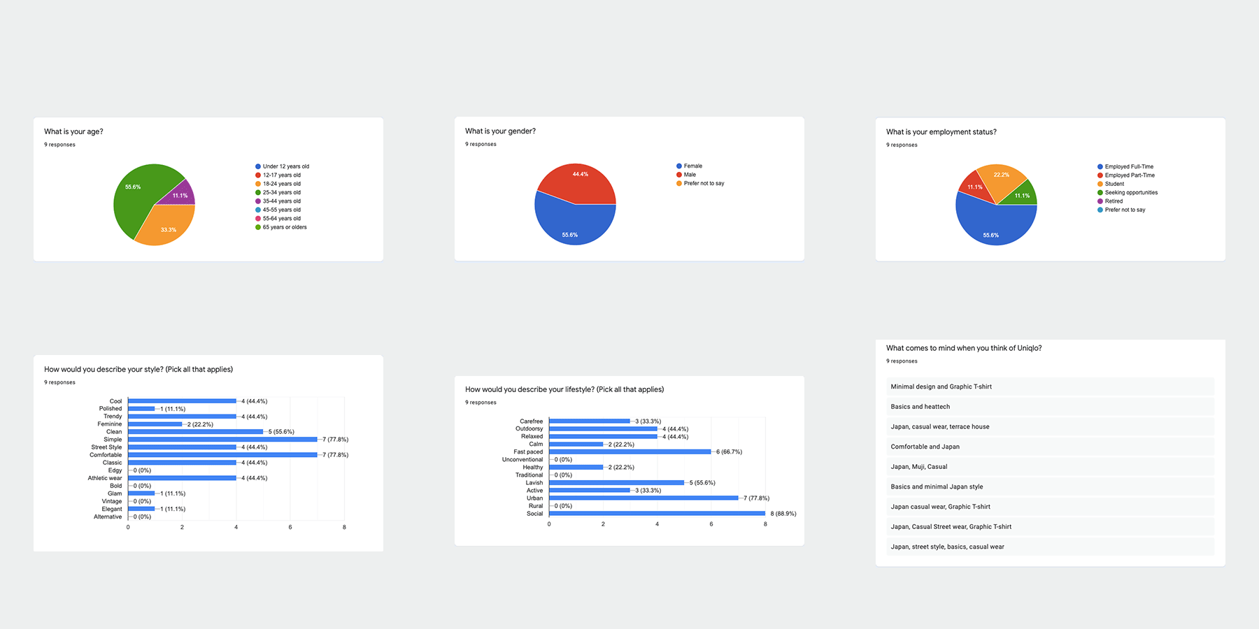
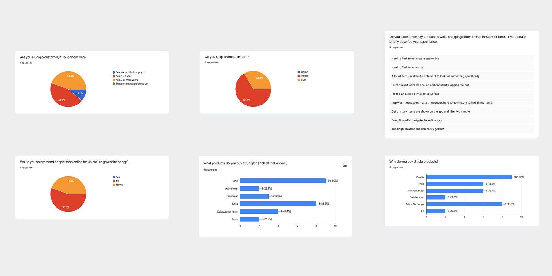
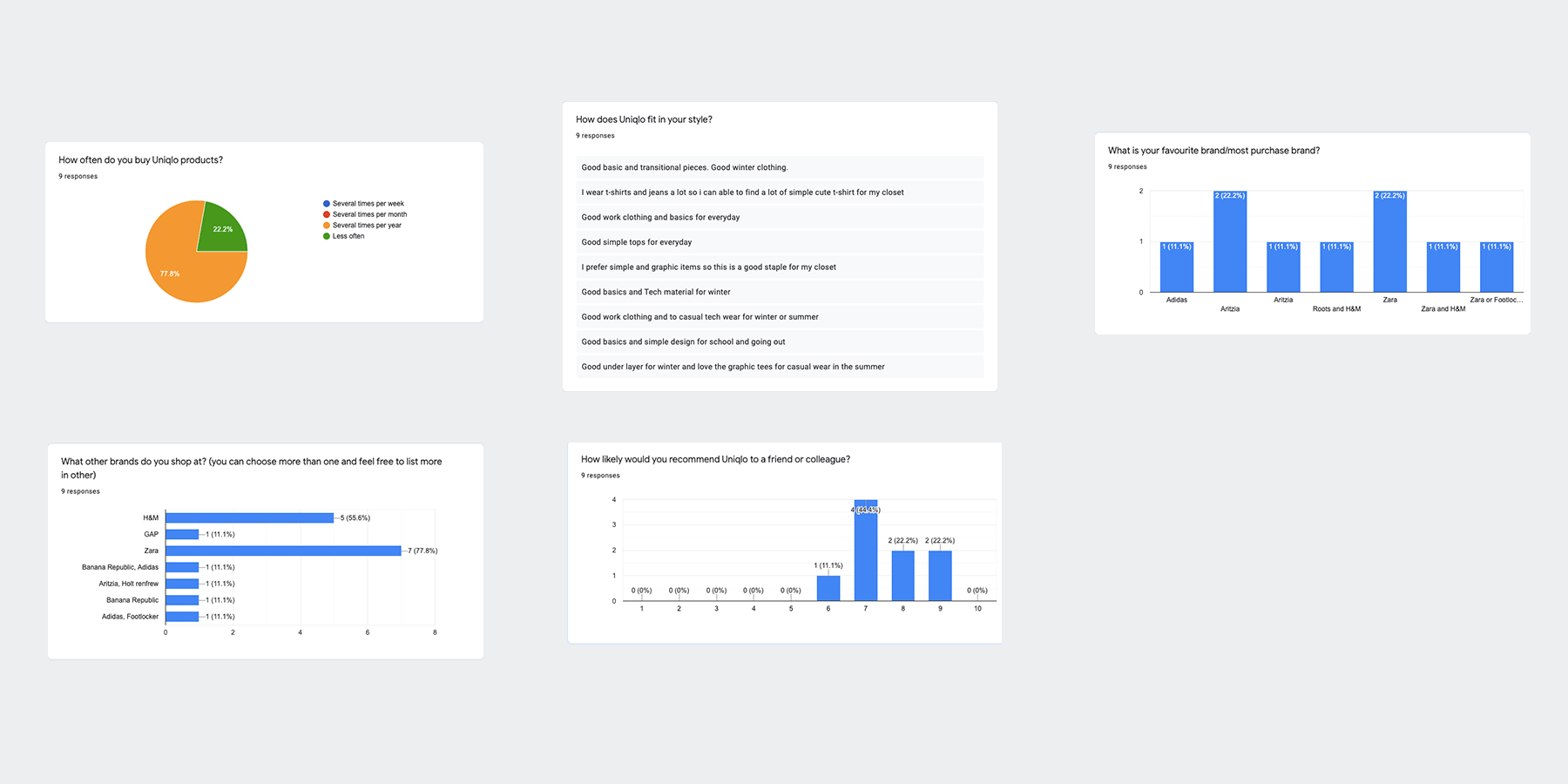
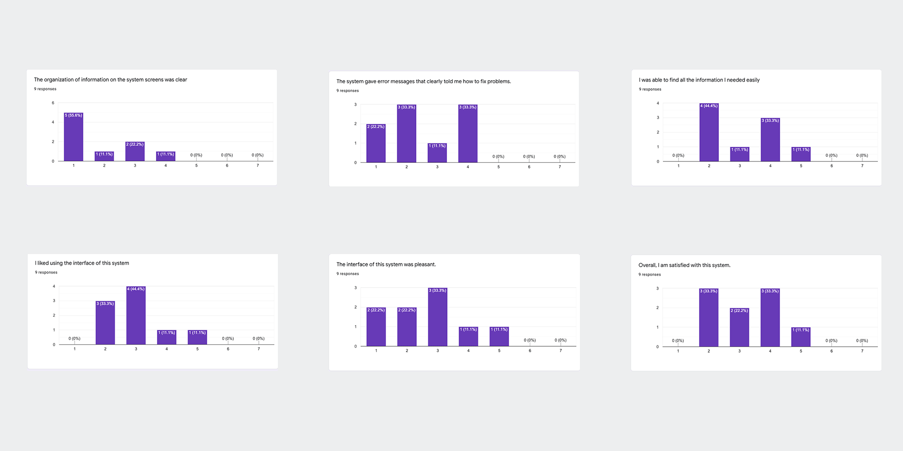
The information gained in part 1 lacks data on customers who shop at Uniqlo and their reasonings. To obtain this data, I created a survey asking about fashion as well as lifestyle questions and sent it to friends and family. The findings from the survey show that the majority of the customers have a comfortable, simple style that could extend to street, classic, or athletic style. The majority live a fast-paced urban style that fits Uniqlo’s target demographic. Customers go to Uniqlo for their quality and basic design, which could imply a low demand for frequent purchases. A significant percentage also shop at Zara. Over half of the customers only shop in-store, and the rest will do both on and offline shopping, but non will exclusively shop online.
RESULTS OF SURVEY
CUSTOMER FEEDBACK
To identify issues currently within the existing app, 50 reviews were collected each from google’s play store and apple’s app store. Only most recent reviews were uses to get issues that are most similar to the current version of the app, and only matters that are related to design or usability errors were recorded down. Overall the repeated concerns were issues related to poor navigation, hard to access features due to the awkward placement and poor communication with the system.
PART 3: USABILITY TESTING
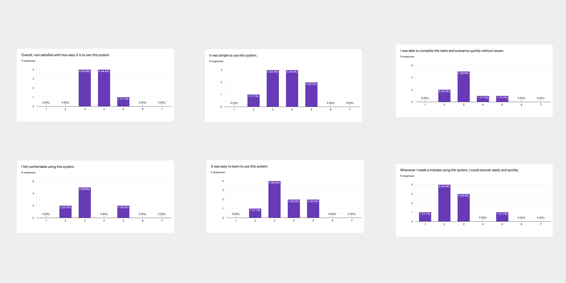
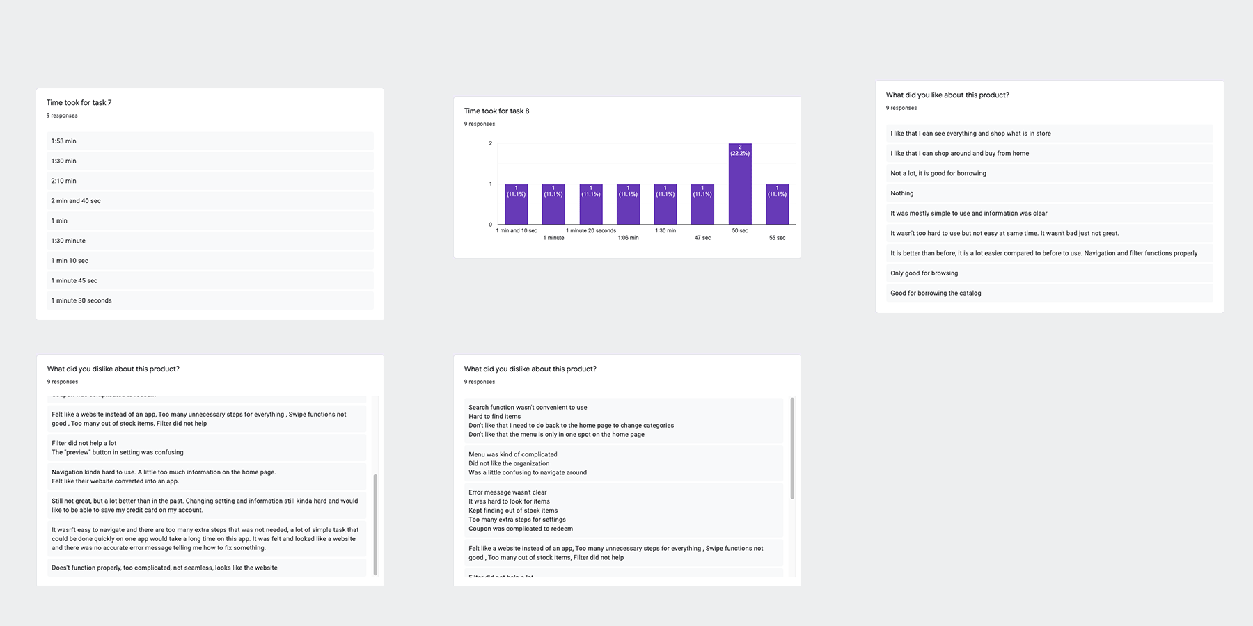
Now that the main issues are known, a usability test was performed. The purpose of this usability testing was to identify exact locations where the problems occurred, how users interact with the system, their thought process while navigating throughout the system and find further usability problems that were not mentioned in the feedback. In the end, each tester completed a post-usability questionnaire where they rank how usability they found the system and express any thoughts they had. The result shows that almost every user had trouble identifying items and experience issues trying to locate specific features when asked.
PART 4: PERSONAS
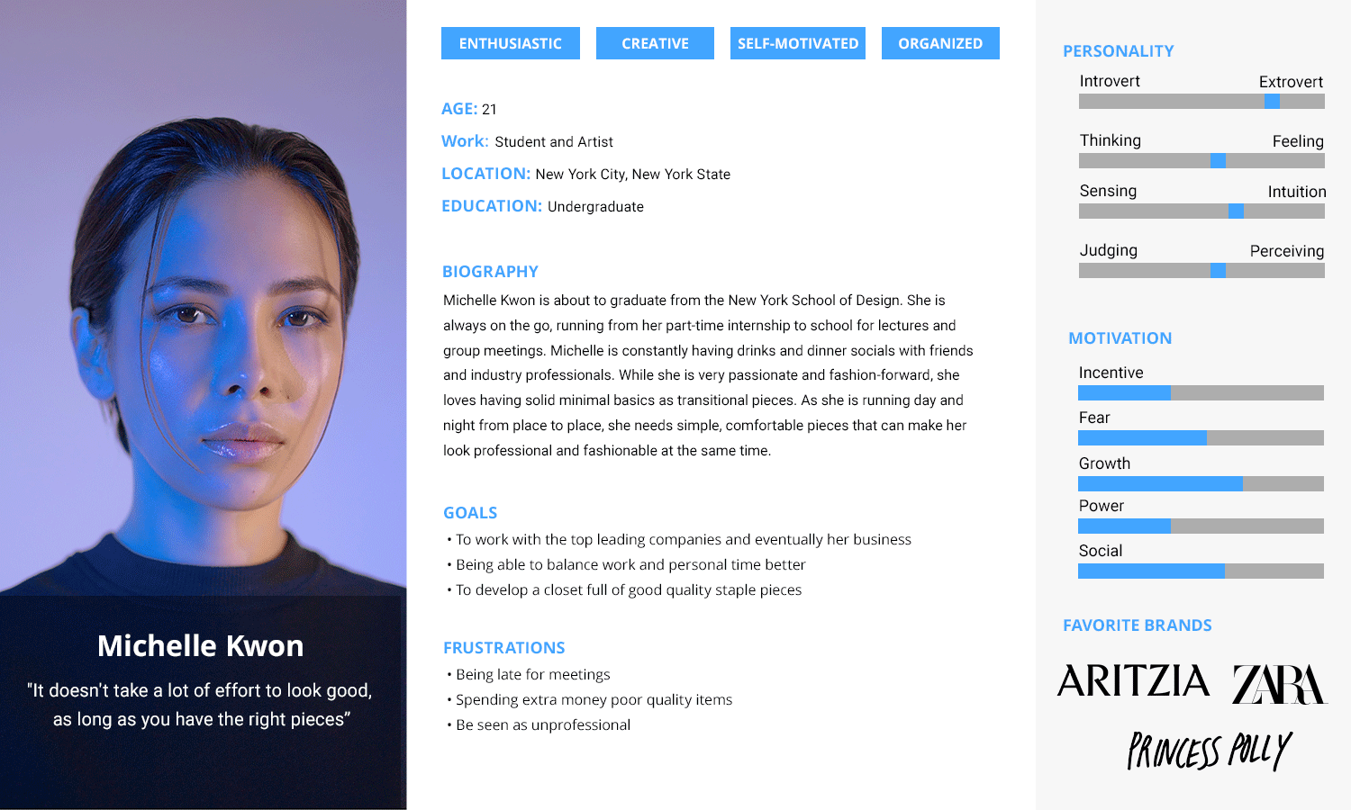
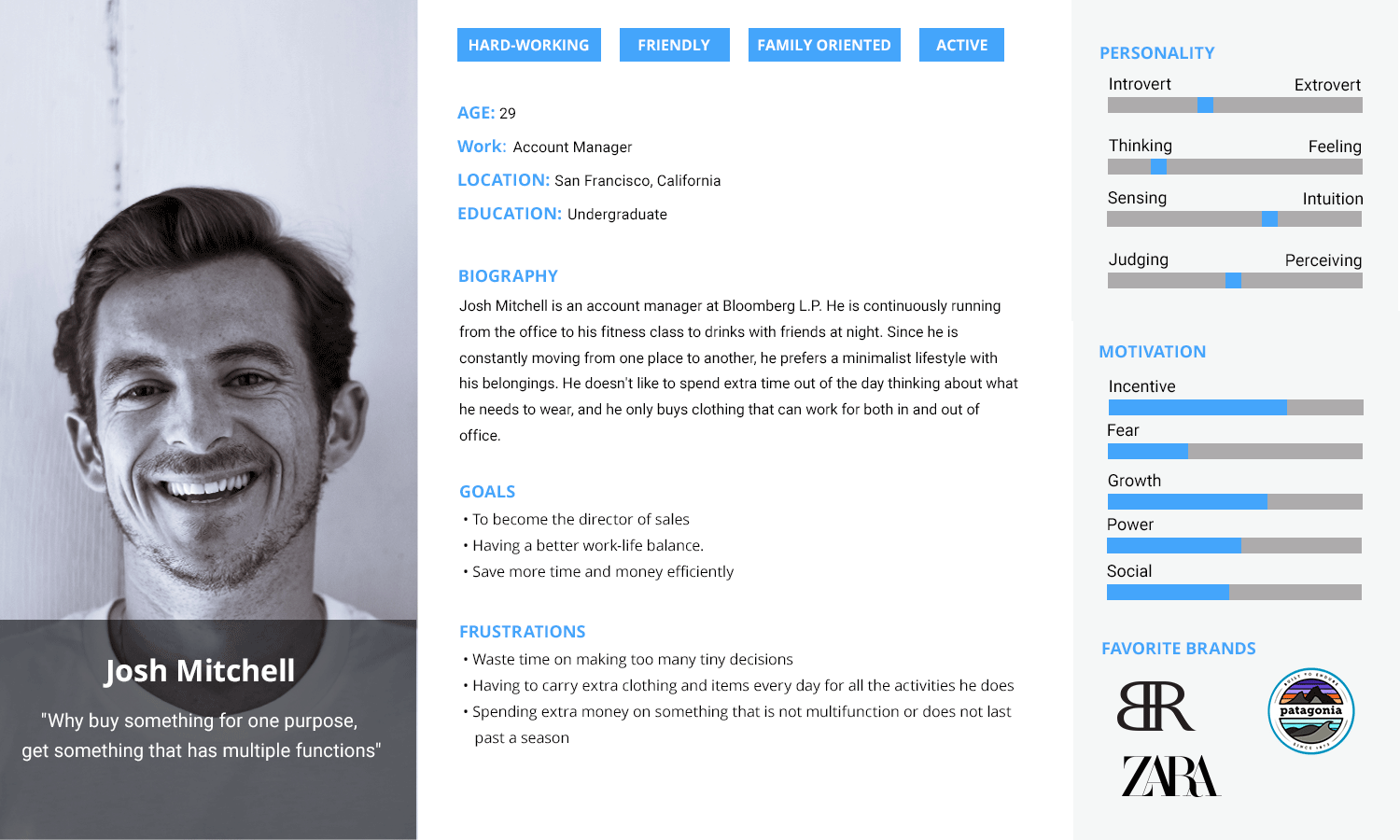
With the information obtained, I created 2 personas that would best represent the costumers at Uniqlo.
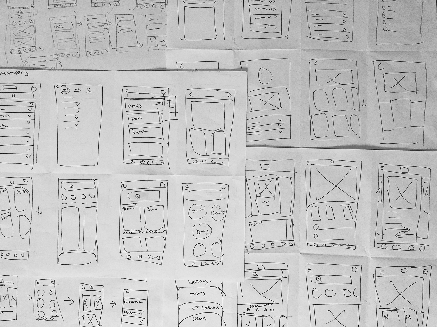
IDEATIONS & WIREFRAMES
LOW-FIDELITY MOCKUPS
HIGH FIDELITY MOCKUPS
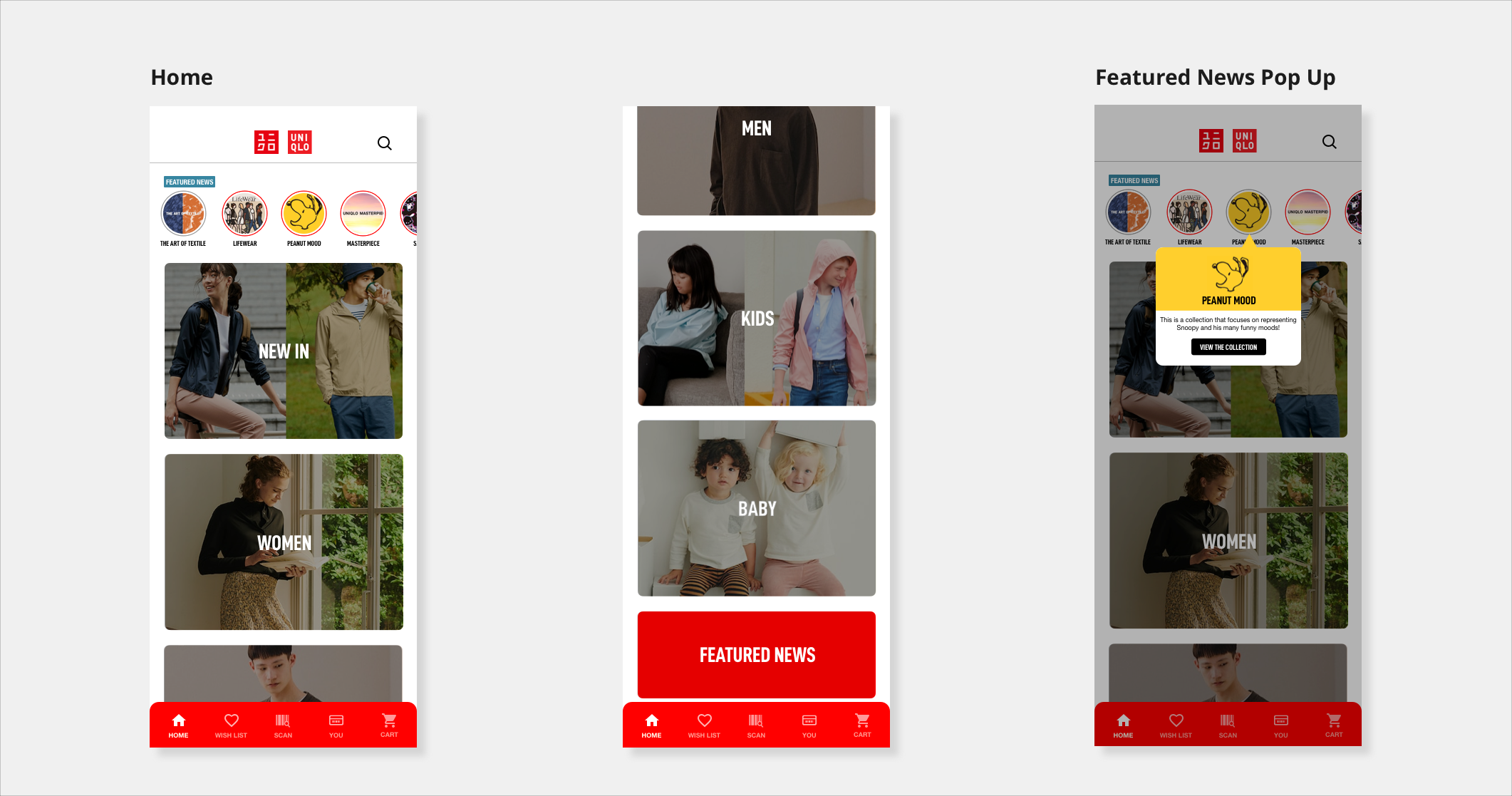
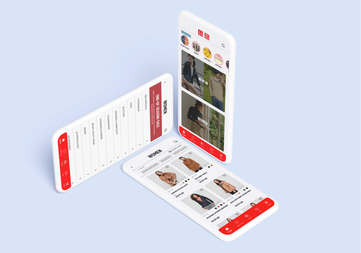
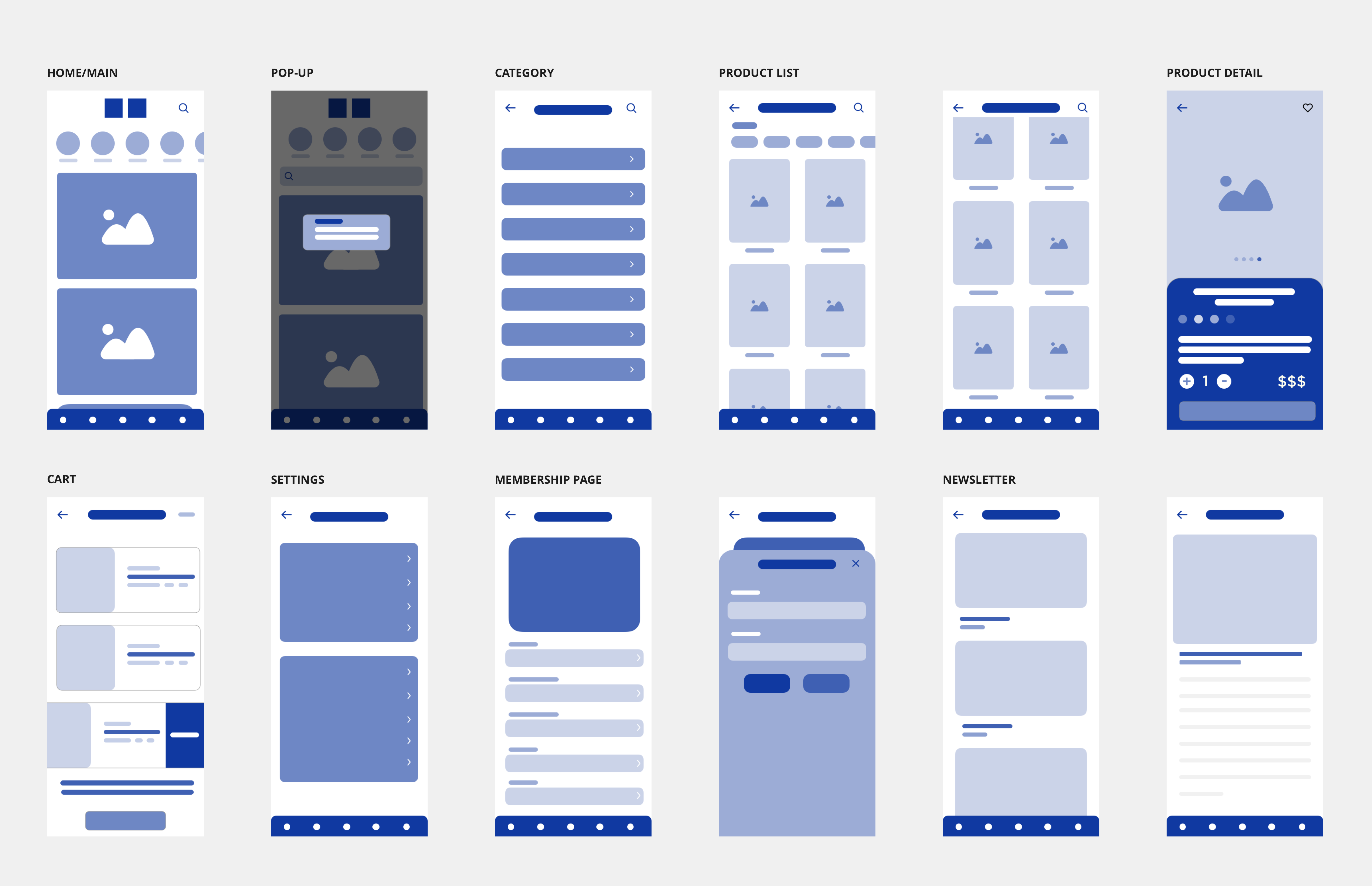
Since navigation is one of the main issues people experience, I wanted to simplify the app to the bare minimum to establish a clear hierarchy and flow for users. On the home page, the only thing shown is the main categories and featured news. That allows users to recognize a clear starting point where users can branch-off and this enables them to switch between item types without having to go back to the home page. Since there are constant updates and announcements made on Unqlio, I added a section where users can preview each update in addition to a separate page to see full details.
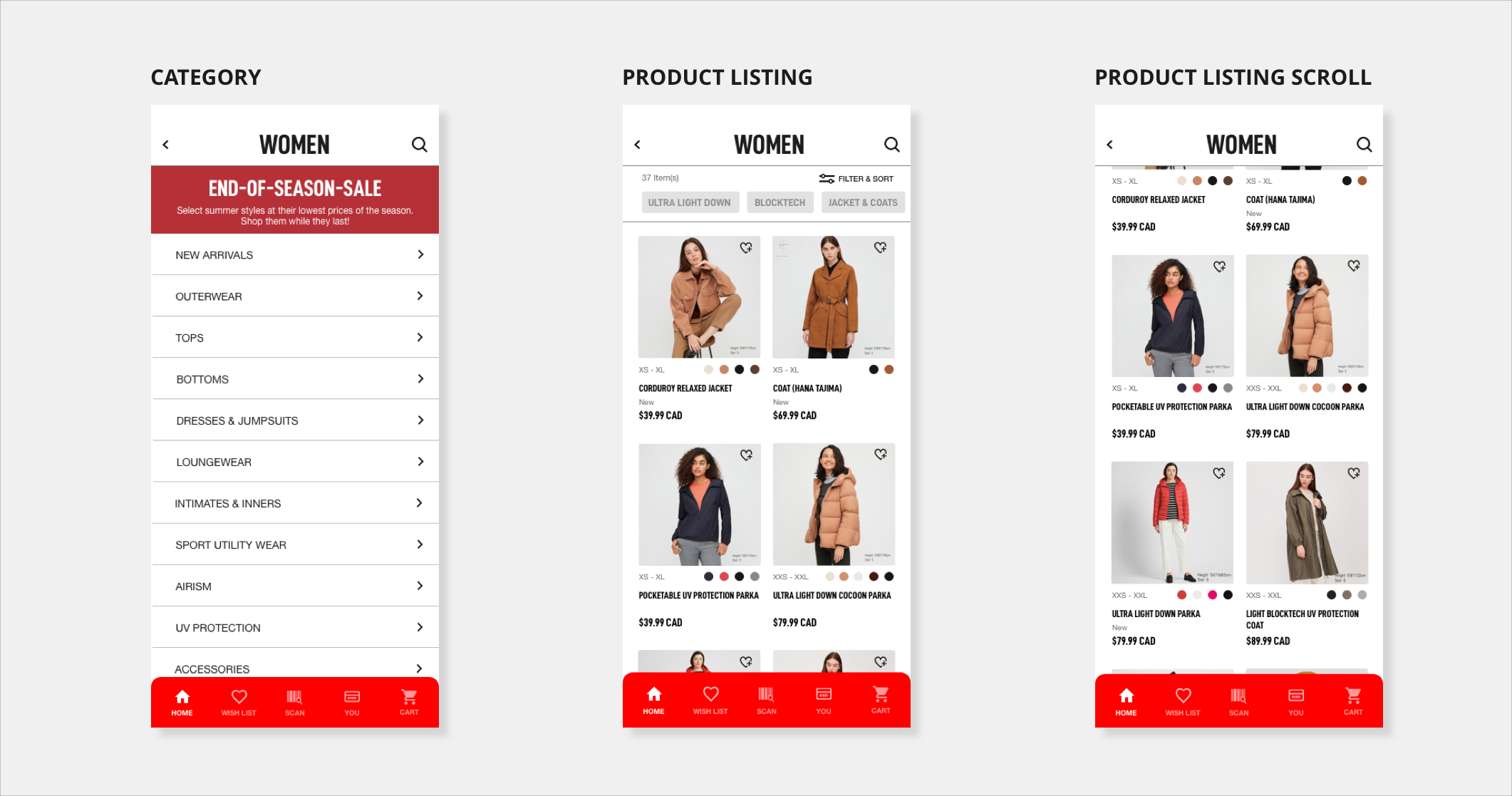
In the Uniqlo app, each item type is automatically separated into their subcategories (ex.blocktech outerwear, jackets, parka, etc.). This helps organize items, but it could be hard for users who don’t know the brand well. I changed it to allow all items to be displayed and have the subcategories be an extension to the filters, allowing more control on the user end to what they want to see.
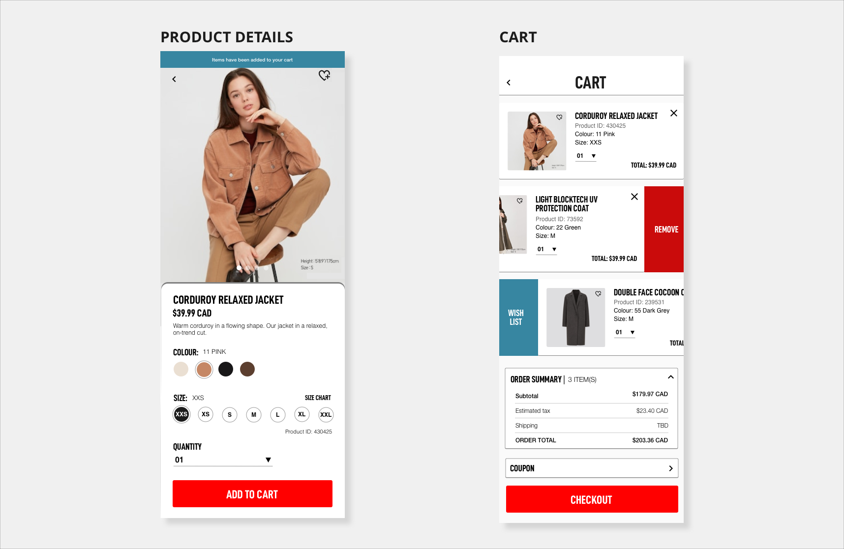
I reduced the information on the product page to simplify it and added round icons to separate each feature allowing essential features like the “add to cart” button to be easily seen. On the cart page, I combined common gestures to increase user flow.
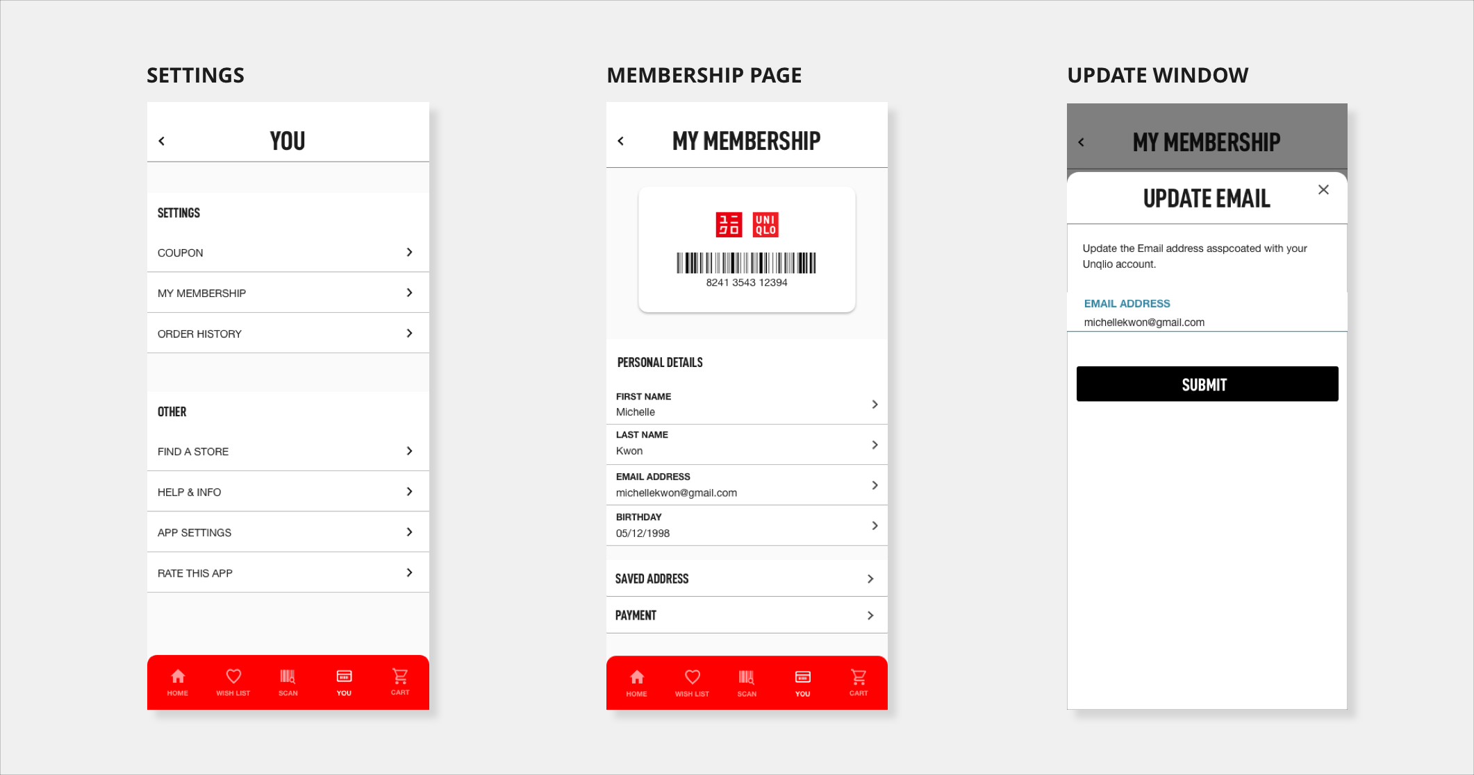
In the current app, membership profiles are displayed in a pop-up window and involves several steps to reach. By doing this, it can be challenging to find and can cause the user to confused the close button as a back button. To reduce any confusion, all features in settings will have a page, and pop-up windows will be used only to update information.
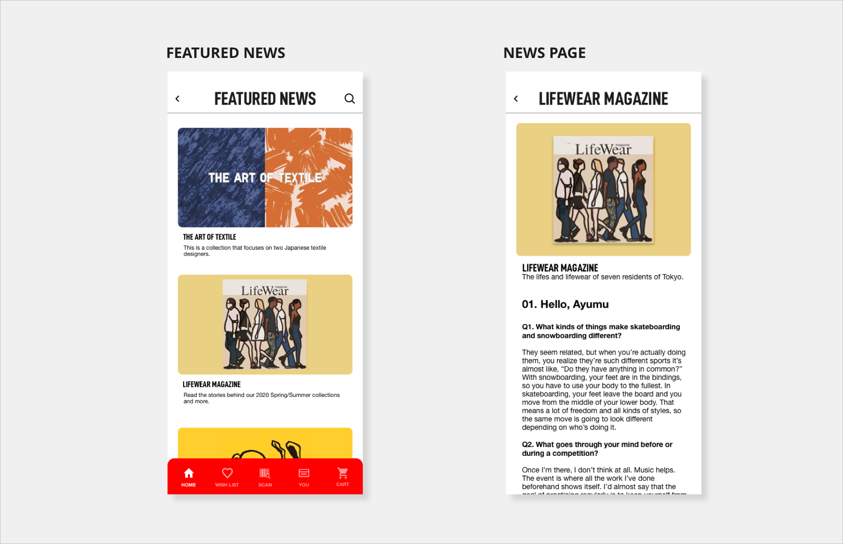
Uniqlo has a lot of collaborations and announcement made on their website, I added to featured news page to ensure that all information is also present on the mobile app.
© 2020 Nancy Le All Rights Reserved
